 Storeino
Configuration
Config Structure
A Storeino theme comes to life through a configuration composed of three integral components: schema, settings, and current. Upon project installation, a fundamental configuration is in place, forming the cornerstone of your theme's functionality.
Delving deeper, we will acquaint you with the essential structure and purpose of each component:
Schema
The Schema component serves as the architectural blueprint, defining the fields to be selected for every individual theme component. The selection process is meticulously outlined within the field's object. Notably, the ids field within the schema remains immutable and is auto-populated.
Current
Within the Current segment, the structural layout and initial values for each theme component are established. This data is extracted and incorporated into the theme project, thereby shaping its core. Notably, this information is automatically generated from the settings.
Settings
In the Settings component, a crucial link is established. While the initial values can be modified for each client through the customizer, the connection between the values returned by the customizer and those applied in the current segment is facilitated by settings. This synchronization ensures seamless coherence between customization and implementation.
Config Exemple
{
  "config": {
    "schema": {
      "fields": {},
      "ids": {}
    },
    "settings": {
      "tabs": []
    },
    "current": {
      "sections": {},
      "translates": [
        {
          "language": "AR",
          "properties": []
        },
        {
          "language": "FR",
          "properties": []
        }
      ]
    }
  }
}
By unraveling the nuances of this configuration triad, you gain a comprehensive understanding of how these components interact harmoniously to mold the essence of your Storeino theme.
Settings Structure
The overarching structure of settings adopts an array format, encompassing multiple sections.
Each section is marked by distinct attributes:
Name :A descriptive identifier for the section.Icon Type :Determines the icon's appearance within the customizer.Hidden Path :Points to a boolean property within the current component, deciding the section's visibility.Blocks :An array comprising individual blocks within the section.
Each block within a section adheres to a specific blueprint, incorporating the following properties:
Name :The block's distinctive label.Note :A concise overview of the block's purpose.Values :A list outlining the fields contained within the block.
Every field possesses vital attributes:
Name :The field's identity.Type :Specifies the field's nature.Path :Indicates the property's location within the current component.Note :Offers a brief field description.Value :Provides the initial field value, establishing a connection with the Current component.
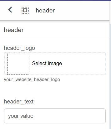
Settings Exemple
{
  "settings": {
    "tabs": [
      {
        "name": "global_options",
        "sections": [
          {
            "name": "header",
            "icon": "select_all",
            "blocks": [
              {
                "name": "header",
                "values": [
                  {
                    "name": "header_logo",
                    "note": "your_website_header_logo",
                    "path": "sections.header.logo",
                    "type": "tc_image",
                    "value": null
                  }
                ]
              }
            ]
          }
        ]
      }
    ]
  }
}
This intricate network of properties and relationships creates a cohesive configuration structure. As you navigate through this framework, you wield the power to finely customize your Storeino theme, molding it according to your preferences and requirements.
Field Data Types
The syntax to designate field data types is outlined as follows:
| Type | Possible default values | Possible default values |
|---|---|---|
| Input | String | Data of type input : text, number |
| Color | String | Data of type color : hex, rgb |
| Html | html | tc_html |
| Gradient | Array of string | tc_gradient |
| Image | null | tc_image |
| Select | null | tc_Select |
| Menu | null | tc_menu |
When dealing with numeric values, we retain the tc_input type while appending the property "input_type": "number" to the configuration. This ensures accurate representation of numerical data.
By adhering to these data types, you lay a solid foundation for structuring your Storeino theme, enabling seamless interaction and dynamic customization.
Update Config
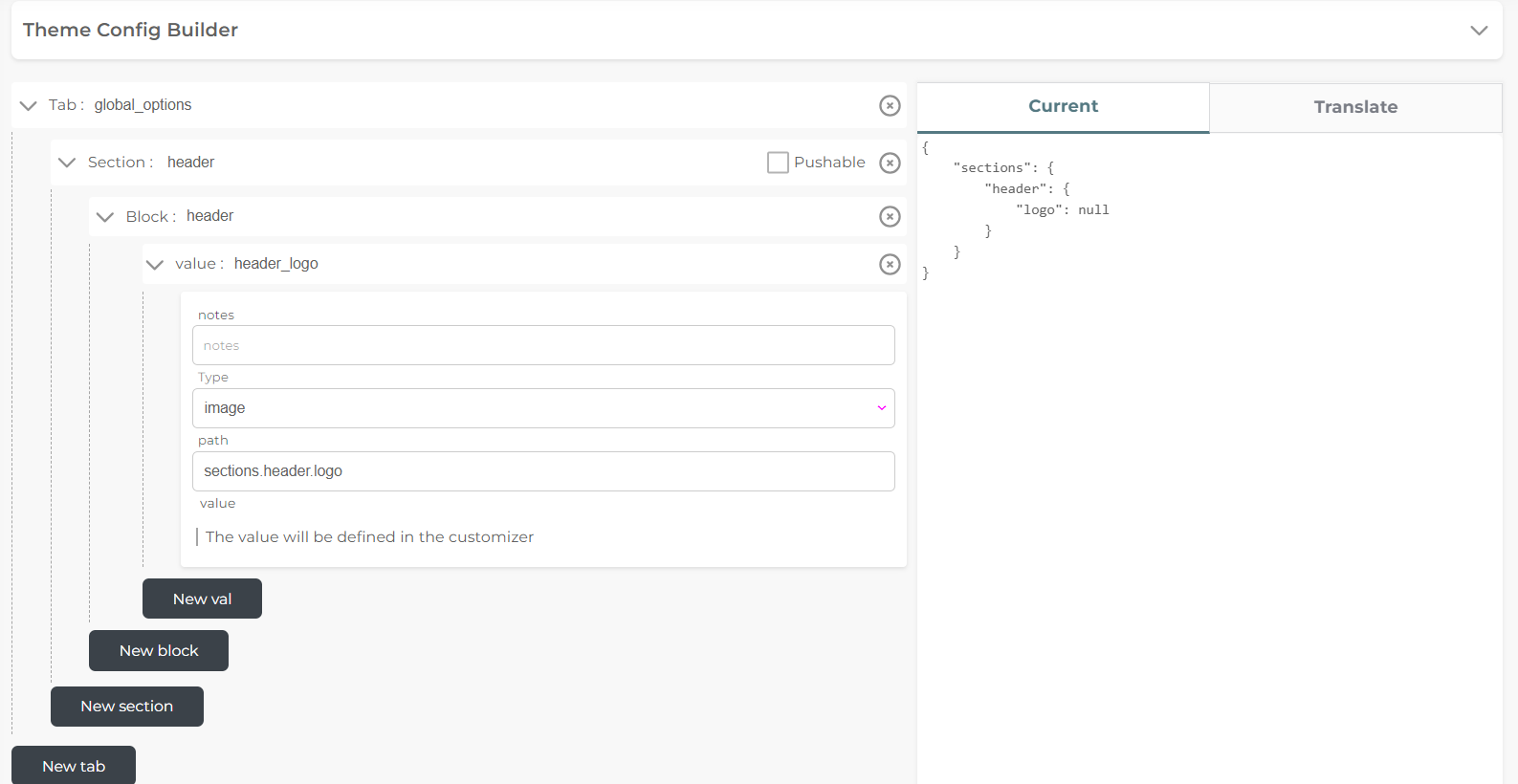
Before immersing yourself in development, the initial stride involves updating your theme's configuration, tailoring it to your unique vision and objectives.
Configured in JSON format, this update process seamlessly unfolds within the Theme Update section of your development environment. Once your theme is established, the update space becomes accessible, paving the way for tailored configurations.
Prior to commencing, take a moment to explore this update space, acquainting yourself with its mechanics and nuances. This preliminary exposure grants you a comprehensive understanding of the update mechanism.
Global theme data is organized into two distinct segments:
General Data :Encompassing essentials like title, publicName, description, and image.Config Data :Comprising the tuple (schema, settings, current), which forms the backbone of your theme's functionality and aesthetics.
By embarking on this configuration journey, you lay the groundwork for a personalized and dynamic Storeino theme that resonates uniquely with your project's essence.
Pushable section && Fixed block
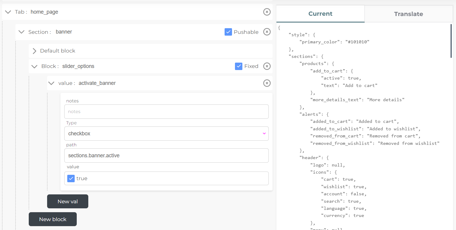
By default, the quantity of blocks within a section adheres to your predefined model, granting customers limited control within the customizer. However, to transcend this boundary, we introduce the "pushable" property for sections. This empowers clients to manipulate the block count, amplifying customization possibilities.
Upon enabling the "pushable" property for a section, clients gain the ability to both append and remove blocks within the section. The initial blueprint for added blocks aligns with the "Default block" configuration.
Furthermore, the "fixed" property introduces the concept of immutable blocks. When employed, this property designates certain blocks as non-removable, preserving their presence despite customization alterations.
This dual mechanism, involving "pushable" sections and "fixed" blocks, fosters an environment of versatile customization while safeguarding the integrity of essential components.
Incorporating the customizer into your code is a straightforward process. Simply follow this example:
<template>
  <div class="banners-list">
    <div
      v-for="(item, i) in Object.values($settings.home.banners)"
      :key="i"
      class="banner-item"
    >
      <img
        :src="item.image.src"
        :alt="item.image.title"
        class="banner-image"
        width="400"
        height="200px"
      />
    </div>
  </div>
</template>

<script>
export default {
  mounted() {
    console.log(Object.values($settings.home.banners));
  },
};
</script>
Value Exploration
When examining the "value" component within settings, you'll observe fundamental attributes at play: type, path, note, and value.
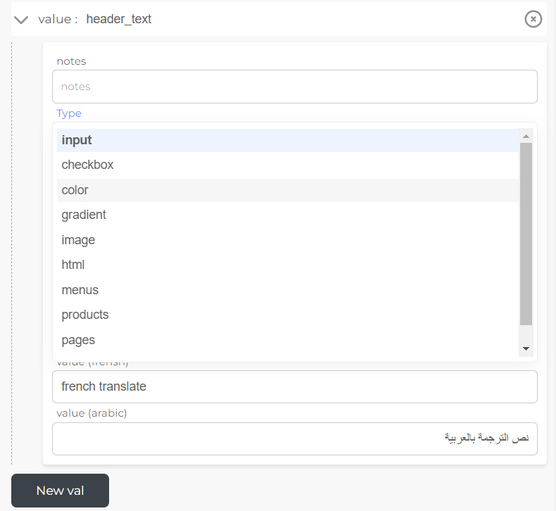
For "input" types, an additional property, "input type," can be introduced to specify whether the entry is textual or numerical. Additionally, both "input" and "html" types allow for translation by enabling the property "is translatable" for French and Arabic translations.
Notably, the default values for various types are as follows:
- "images" and "menu" : null
- "products," "collection," and "pages": an empty array
The application of these attributes allows for nuanced customization and localization, ensuring your theme's adaptability and resonance with diverse audiences.
{
  "name": "header_logo",
  "note": "your_website_header_logo",
  "path": "sections.header.logo",
  "type": "tc_image",
  "value": null
}
Config Current
Central to the update process is the utilization of the "path" property within settings, intertwining customizer-applied values with the current component.
This intrinsic link fosters alignment between the current and settings objects. Notably, the current component is dynamically generated to mirror the value specified in the path. This auto-generation ensures unwavering coherence between the settings and current components, harmonizing their manifestation and functionality.
Current Exemple
{
  "current": {
    "sections": {
      "header": {
        "logo": null
      }
    }
  }
}
Translation of Inputs
Incorporating translation into text or HTML data is a powerful approach to ensure comprehension across various languages. Presently, translation is available for French and Arabic languages.
To enable translation, activate the "translatable" option and populate the French and Arabic values within the "value(french)" and "value(arabic)" fields, respectively. Similar to the current object, the translation object is automatically generated, fostering seamless multilingual integration.
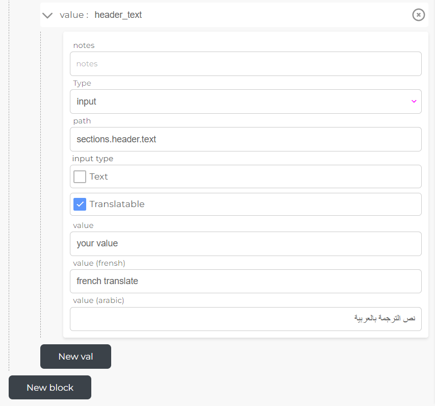
Remember to solidify your changes by clicking the "Update" button.
Upon adding and updating the configuration, the dynamically generated current settings take effect within the Customizer, facilitating a dynamic and localized user experience.
Translation Exemple
"translates": [
  {
    "language": "FR",
    "properties": [
      {
        "name": "sections.header.text",
        "value": "french translate"
      }
    ]
  },
  {
    "language": "AR",
    "properties": [
      {
        "name": "sections.header.text",
        "value": "نص الترجمة بالعربية"
      }
    ]
  }
]
Translation of customizer
As you prepare to publish your theme, you may observe that the new fields retain the names assigned within settings. To infuse translation into these fields, a trio of JSON files (translate-EN, translate-FR, translate-AR) have been introduced within the project's static folder.
Each file follows a consistent structure :
"property_name": "value"For every field, the "property_name" remains consistent across all languages, while the "value" varies based on the language. To illustrate, consider the translation of the "global_options" property across English, French, and Arabic:
translate-EN.json
{
  "global_options": "Global Options"
}
translate-FR.json
{
  "global_options": "Options globales"
}
translate-AR.json
{
  "global_options": "Global Options"
}
When naming the "propertyname," utilizing underscores () between words is recommended for ease of reference.
By adopting this structured approach, you seamlessly introduce multilingual capabilities into the customizer, enhancing user interaction and understanding across diverse linguistic contexts.
Customizer
In scenarios where you haven't established your own custom configuration, the customizer becomes your dynamic tool for modifying existing values within the current component.
Embark on this customization journey by visiting the following link: https://admin.storeino.world/stores/customizer. Here, you'll find the platform to effortlessly tweak and refine values, tailoring your Storeino theme to your precise preferences.
Customizer Exemple