 Storeino
Hello World — your first section
Time budget: 20 minutes. By the end you'll have a PromoStrip section visible in the builder library and drag-droppable onto any page.
We'll build a thin announcement strip: emoji, text, link. Like the "FREE SHIPPING ON ORDERS OVER $50 →" bar you see at the top of many shops.
Have
npm run devrunning already? Good. Otherwise see Getting started first. You do not need a.envfile or an API token for this walkthrough — PromoStrip renders entirely from its config, no API calls.
1. Create the folder
In souk-theme/components/sections/, create:
PromoStrip/
  ├── index.vue
  └── manifest.json
The folder name must match exactly what you'll put in manifest.type (case-sensitive).
2. Write the manifest
components/sections/PromoStrip/manifest.json:
{
  "type": "PromoStrip",
  "category": "content",
  "icon": "solar:megaphone-linear",
  "preview": "",
  "title": "Promo strip",
  "description": "Thin announcement bar with emoji, text, and an optional link.",
  "pages": ["any"],
  "maxPerTemplate": null,
  "schema": [
    {
      "type": "text",
      "path": "emoji",
      "label": "Emoji",
      "default": "🚚"
    },
    {
      "type": "text",
      "path": "message",
      "label": "Message",
      "translatable": true,
      "default": "Free shipping on orders over $50"
    },
    {
      "type": "text",
      "path": "linkText",
      "label": "Link label (optional)",
      "translatable": true,
      "default": "Shop now"
    },
    {
      "type": "link",
      "path": "linkHref",
      "label": "Link URL",
      "placeholder": "/shop",
      "default": "/shop"
    }
  ],
  "defaults": {
    "emoji": "🚚",
    "message": "Free shipping on orders over $50",
    "linkText": "Shop now",
    "linkHref": "/shop"
  },
  "aiHints": {
    "keywords": ["promo", "strip", "banner", "announcement", "free shipping"],
    "examples": []
  },
  "styleKeys": [
    { "key": "section", "label": "Strip background + padding" },
    { "key": "message", "label": "Message text (color, size)" },
    { "key": "link", "label": "Link (color, weight)" }
  ]
}
Save it. Notice the moving parts:
"type": "PromoStrip"must equal the folder name.- Every field's
"path"(emoji,message,linkText,linkHref) is what we'll read fromconfigin the component. "translatable": trueonmessageandlinkTextlets the merchant write a different value per locale.- The three
styleKeysmap to threeuseStylescalls we're about to make.
3. Write the component
components/sections/PromoStrip/index.vue:
<script setup lang="ts">
import { computed } from 'vue';
import { useT } from '~/composables/useT';
import { useEditable } from '~/composables/useEditable';
import { useStyles, type ElementStylePayload } from '~/composables/useStyles';

type Translatable = string | Record<string, string | undefined>;

interface PromoStripConfig {
  emoji?: string;
  message?: Translatable;
  linkText?: Translatable;
  linkHref?: string;
  styles?: Record<string, ElementStylePayload>;
}

const props = defineProps<{ config: PromoStripConfig }>();
const t = useT();

// Element-scope styling. Each call matches one `styleKeys` entry in the manifest.
const sectionStyles = useStyles('section', () => props.config?.styles, ['self']);
const messageStyles = useStyles('message', () => props.config?.styles);
const linkStyles = useStyles('link', () => props.config?.styles);

// Inline-editable text. The merchant can click the message directly inside the
// iframe and type a new value — no need to open the inspector.
const messageEdit = useEditable('message', { translatable: true });

// Computed values with defaults so the section never renders blank.
const emoji = computed(() => props.config?.emoji || '');
const message = computed(() => t(props.config?.message) || '');
const linkText = computed(() => t(props.config?.linkText) || '');
const linkHref = computed(() => props.config?.linkHref || '');
</script>

<template>
  <div
    :class="[
      sectionStyles.attrs.value.class,
      'flex items-center justify-center gap-2 py-2 px-4 text-sm bg-ink text-surface'
    ]"
    :data-element-key="sectionStyles.attrs.value['data-element-key']"
  >
    <span v-if="emoji" aria-hidden="true">{{ emoji }}</span>
    <span
      v-bind="messageEdit.editableProps()"
      :class="messageStyles.attrs.value.class"
      :data-element-key="messageStyles.attrs.value['data-element-key']"
    >
      {{ message }}
    </span>
    <a
      v-if="linkHref && linkText"
      :href="linkHref"
      :class="[linkStyles.attrs.value.class, 'underline underline-offset-2 font-medium']"
      :data-element-key="linkStyles.attrs.value['data-element-key']"
    >
      {{ linkText }} →
    </a>
  </div>
</template>
That's the whole section. Roughly 50 lines, the smallest non-trivial section in the codebase.
4. Restart dev
Vite resolves the section registry at boot via i — a new folder needs a full restart, not just HMR:
# Ctrl+C, then:
npm run dev
5. See it in the library
Open the builder (https://admin.storeino.world/stores/themes → Customize, or your local builder).
In the section library on the left, scroll to the content category. You should see Promo strip with the megaphone icon. (No preview image yet — that's fine for now.)
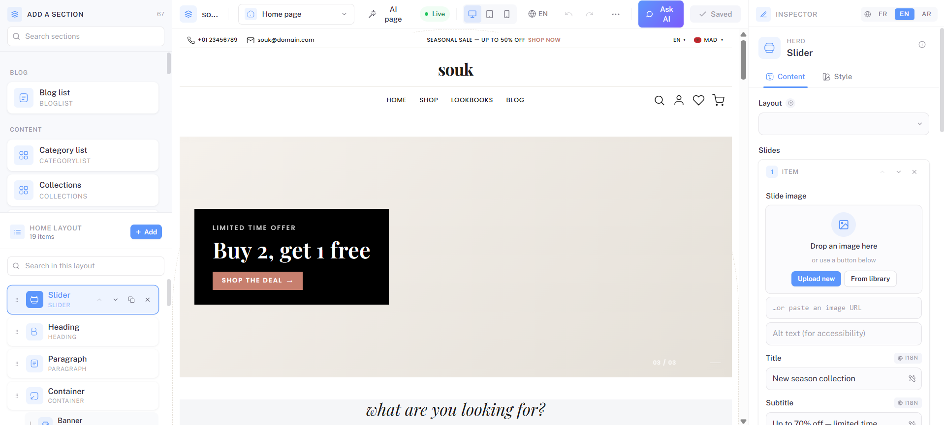
If you don't see it, jump to Troubleshooting → "My section doesn't show up in the library".
6. Drag, edit, save
- Drag the Promo strip card onto the home page (above the existing header is a good spot).
- The strip appears with the defaults from your manifest: 🚚 emoji, "Free shipping..." message.
- Click the message inside the iframe. You can type directly —
useEditablemakes the text contenteditable when the builder is connected. - Open the right-hand inspector. All four fields (Emoji, Message, Link label, Link URL) are editable.
- Switch to the Style panel. The dropdown shows three scopes — Strip background, Message text, Link. Pick "Message text", set a new color → the iframe updates instantly.
- Click Save (top-right). Refresh the storefront tab without the builder — the strip persists.
You just shipped a working section.
What you actually learned
- The two-file folder pattern.
- How
manifest.type↔ folder name ↔<TypeName>in the registry are linked. - How field
pathin the manifest maps to keys onprops.config. - How
useT()reads translatable values. - How
useStyles()exposes element-scope edits to the merchant. - How
useEditable()enables click-to-edit inside the iframe.
Every other section in the codebase is a richer version of the same five ideas.
Next
Open Anatomy of a section for the systematic reference, Writing the component for deeper composable docs, or just go browse components/sections/Banner/ to see the same patterns at production scale.